Proof Positive Process

The Blackwater Distilling Redesign

Never one to let its size dictate its moxie, Maryland was the only state that never enacted a Prohibition enforcement law. This same pride, independence, and obsession with fine spirits lies at the heart of the Blackwater Distilling brand. When it was time to evolve and organize their brand, the Blackwater team came to Tribe, knowing we could help them respectfully maintain the pioneering, fearless, and genuine spirit they’d worked so hard to achieve.

The project didn’t start with creativity. It started with good old-fashioned research and a targeted, collaborative process. The result: a tight, cohesive brand and completely reimagined, beautifully designed packaging for the client.

Beauty & the Beast

Named after a booze-toting merchant vessel that was overtaken by none other than Blackbeard and sent to the bottom of the Chesapeake Bay, Sloop Betty Vodka has enjoyed a much greater destiny than her ill-fated namesake. But not without some choppy water along the way.

Blackwater’s belle had become so respected and sought after, she’d taken on a life of her own. In fact, Betty was drowning out the overall Blackwater brand. Her success was a good problem to have, but a problem nonetheless.

It didn’t stop there. Picaroon Rum, Blackwater’s other popular product line, had likewise started to develop its own identity. The success of these individual products meant there was very little shared brand equity across the product lines. Consumers weren’t seeking out the Blackwater brand—they were simply buying single products they liked. In other words, the individual products were popular but they weren’t contributing as much as they could to create a powerful brand.

A Conversation is a Good Place to Start

For Tribe, this was much more than a simple design exercise—there was too much history, too much craft, too much at stake. Before we even gave a thought to design, we sat down to listen, learn, and explore the brand. The Blackwater team told us about their past, from the company’s humble beginnings, through the decisions that got Blackwater Distilling to where it is today, to where they see the brand in the future.

Through a combination of research and review, we took a long, hard look at everything Blackwater had visually produced to this point. We performed an extensive competitive review. We laid out project goals, discussed existing and potential obstacles, reviewed production processes, and identified specific target audiences.

With only an existing word mark as a logo and no brand documents in place, it was immediately clear that Blackwater needed to define their brand language to help guide them now and in the future. We didn’t want our own predispositions and presumptions to take the lead. So, we worked closely with the team at Blackwater to develop a language that clearly stated who they are as a company and what they wanted their brand experience to be. We turned this language into a powerful and meaningful Brand Platform document—the foundational guide for the brand and any design moving forward.

Legendary Stories. Modern Design.

Armed with the literal language, it was time to turn our attention to the visual language that would reinforce it by holding what we affectionately call our Campfire Meeting. We gathered hundreds of illustrative, photographic, and design-driven samples to create a collection of visuals that aligned with project goals and the newly developed brand platform. Working closely with Blackwater, we curated these samples until the remaining few represented our new path of creative exploration—the colors, looks, styles, and tones that would direct and inspire the design aesthetics of the new packaging.

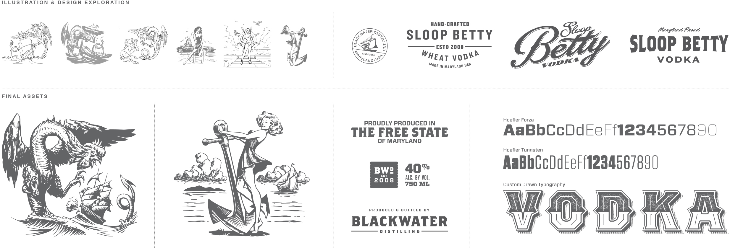
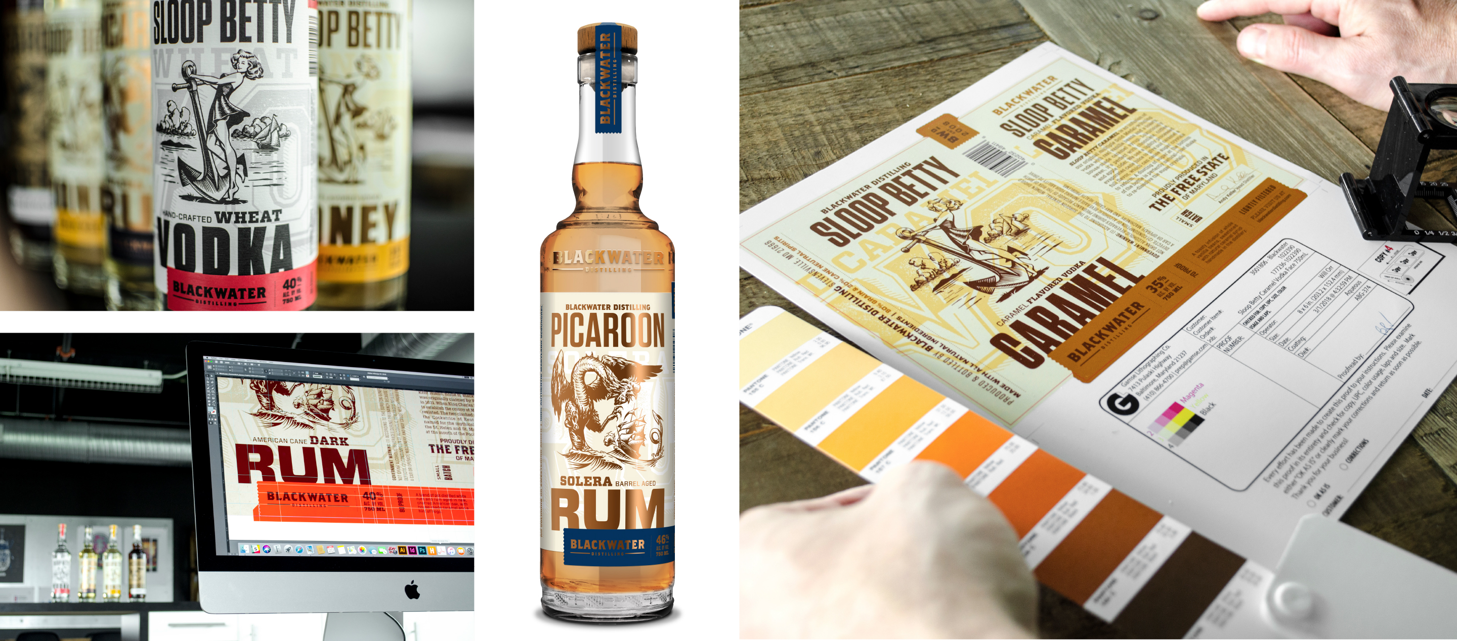
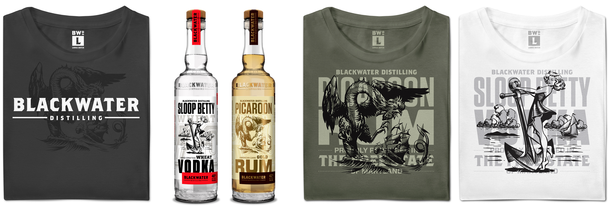
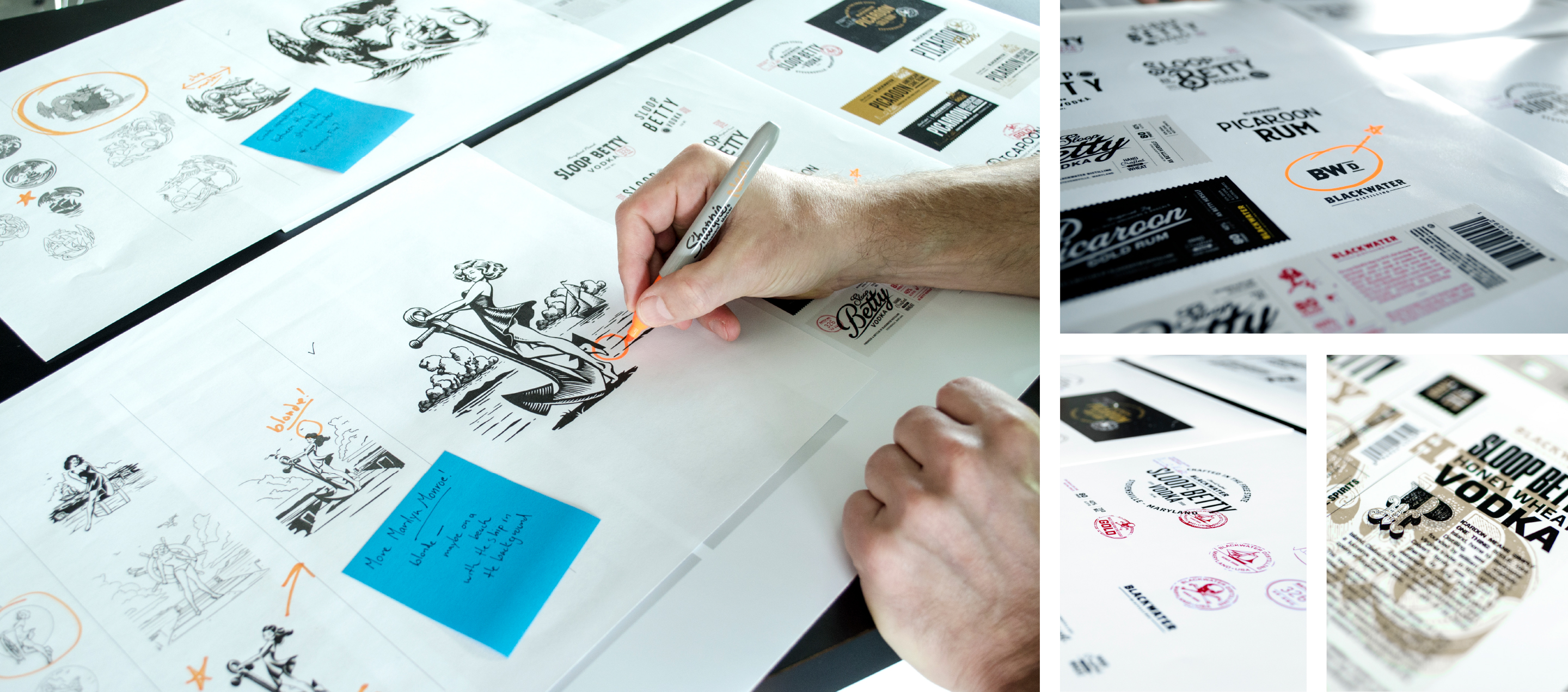
This set up the groundwork for the beginning of the design phase—developing concepts for the new Blackwater packaging. We sketched, reviewed, and debated every detail. We vetted hundreds of ideas. Some made the cut. Most ended up on the cutting room floor. When we were finished, we had a solid base of initial concepts ranging from small evolutionary steps to giant revolutionary leaps.

“I’ve never been so immersed in the process like we were with Tribe. We all felt like we played a part in the creative development instead of just being “the client.” Together, we uncovered some really rich content that I don’t think they or we could have done on our own. Collaboration was the key.” — Lily Bengfort, CMO

Both the Sloop Betty Vodka and Picaroon Rum suites were reimagined to create a cohesive theme across Blackwater’s many offerings. We chose to focus on two local tales of legendary ships that sailed the Chesapeake—the sloop Betty and the warship Cockatrice. For Betty, we selected a lithe pin-up. Picaroon donned a literal depiction of a Cockatrice, the mythical monster for which the warship was named. Both ships’ stories can be traced back to periods of unrest in Maryland’s rich history and reflect the same defiant spirit that defines the Blackwater brand.

With this history in mind, it was imperative that we inject the same energy and life into Blackwater’s new packaging design. Using beautifully etched illustrations, updated color palettes, industrial typography, and intricate local details, we modernized everything without losing the significant historical tie-in.

Given that Blackwater had multiple decision makers from many schools of thought, the informal nature of our presentation made for an inviting, open environment that encouraged trust and collaboration. Opinions were shared, debated, and scrutinized. Some rose to the top and others were put to rest. Most importantly, we all moved forward with a crystal-clear understanding of how the new Blackwater packaging was going to look and made sure that it would support the newly developed brand platform.

We are Maryland's Spirit

Through this creative process, the brand stance and the single idea that Blackwater wants to own emerged: We are Maryland’s Spirit. Previously, there was hardly any associative halo effect between Blackwater products. Now there is no question that every Blackwater product is borne from the same proud, pioneering heart, but each spirit gets to tell its story in a fresh, individual way.

One company. Multiple products. Endless ways to strengthen the brand through properly targeted and engaging package design. Blackwater Distilling can finally show off their rebellious spirit.

“Thanks to all of this work, we no longer have a bunch of standalone brands living on an island. Cohesive and connected — everything works together within one portfolio under the Blackwater umbrella.” — Chris Cook, Blackwater Distilling Co-owner

For a larger view the Blackwater’s new label design click here.